 Functioning Principle of Vision
 Color Mixing Laws
 Color and Printing Process
 Theory of Color
 Teaching Material and Literature
Theory of Color in the Past and Future
Critical Retrospective View at Itten's Theory of Color
The artist painter Johannes Itten was a Bauhaus teacher (school of architecture and applied arts, founded 1919 in Weimar). In 1961 he published his book " Kunst der Farbe " (Art of Color). In it he presented a choice of concepts concerning the theory of color which were common in those days. Above all, he was oriented towards the ideas and writings of Newton, Goethe, Runge, and Hoelzel.
Certainly not least for the reason that there were no other useful publications available for instruction purposes regarding this topic, that book was translated into many languages and spread around the world. This happened now more than 4 decades ago. Unfortunately still today many universities, technical colleges, trade schools, and all-around schools base their teaching on that book. What Itten compiled were the ideas of his time, mostly intuitive concepts of artists.
Everyone doing practical experiments to produce - according to Itten's instructions - a color circle based on his three basic colors has learned that it simply does not work. It is impossible to produce a pure Violet or a pure Green with two of his " basic colors ". It is equally impossible to generate black by mixing these three colors. Today, Itten's stated views are outdated. Now exist provable scientific findings. Theory of color is a part of natural sciences.
Itten's Color Circle
Regrettably, many schools of different levels base their instruction even today on Itten's methods with the consequence that false concepts are taught and learned. Let us take a critical view at the color circle below:
The natural order of pure chromatic colors is a linear arrangement according to the wavelengths in the spectrum. Representing the chromatic basic colors in a circle contradicts this natural order where only straight line connections exist (compare with : Hexagon of Different Chromatic Types).
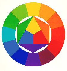
Itten's so-called basic colors yellow, red, and blue which form a triangle inside a circle are no true basic colors. They are rather color mixtures or secondary colors. Itten's blue is a mixture of the Basic Colors Cyan-blue and Violet-blue, Itten's red is a mixture of the Basic Colors Magenta-red and Orange-red. Itten's yellow comes close to the true Basic Color Yellow, but still it is a mixture containing a small part of the Basic Color Orange-red.
The three Itten colors orange, green, and violet which make of the inner triangle a hexagon are not the result of mixing two of Itten's basic colors as it is claimed. In his book " Kunst der Farbe " (Art of Color) these colors are printed as supplementary colors. Only the orange comes rather close when mixing Itten's colors yellow and red. Mixing his red with his blue produces a brownish color with a tinge of violet. Mixing his blue and his yellow produces olive-green. To produce black from these three colors is absolutely impossible. At best one obtains a dark gray.
It is equally impossible to mix from his pairs of compensation colors (complementary colors) a neutral gray, as he maintains. The mixing results are chromatic tertiary colors.
Itten's color circle is incomplete. Some pure chromatic colors are completely missing. The chromatic Basic Color Magenta-red does not exist at all. Also the chromatic Basic Colors Violet-blue, Cyan-blue, and Green are there only as rough approximations. Yellow and Orange-red are inaccurate just as much..
In Itten's schema the two achromatic Basic Colors Black and White do not exist as initial colors of equal importance. To put such a schema on a white background is a didactical error. The background of an optimal schema should be medium gray in order to make the achromatic Basic Colors Black and White truly visible.
It is equally absurd to define the Basic Colors Black and White as "non-colors", as Itten suggests. In reality these are achromatic Basic Colors of equal value and importance. They are absolutely essential for a logical order system of colors. It is surprising that Itten ignored this fact, all the more so since it was described in great detail 150 years earlier by the artist painter Philipp Otto Runge.
Itten's Color Space
As color space - color solid - Itten decided on Runge's sphere which has been published by Runge in 1810 in the Hamburg publishing house Friedrich Perthes under the title " Farbenkugel " (Sphere of Colors). This was 150 years before Itten's book " Kunst der Farbe " (Art of Color) has been published. Apparently Itten decided intuitively on the sphere to be the logically consistent three-dimensional space to represent the wide variety of colors in a systematic order as it meant continuing the color circle concept in the third dimension.
However, already about 40 years before Itten published his book, Wilhelm Ostwald had not just proposed the double cone as color space but also further developed by presenting sectional planes in a systematic order. This double cone constituted a substantial progress towards establishing a three-dimensional order for the diversity of colors. Ostwald already knew that Black and White are equally important Basic Colors. Why did Itten not take any note of it ?
Itten also ignored the color order established by Alfred Hickethier. Hickethier had proposed the cube as color space and published a color atlas where he presented sections through the color space in form of systematic color tables. With it he demonstrated the mixing possibilities existing for the transparent colors yellow, red (Magenta-red), and blue (Cyan-blue) in accordance with the law of Subtractive Mixture. Hickethier's order of colors was a new milestone on the way to an optimized order system for colors. Because in a cube the six chromatic Basic Colors are not anymore located on a single horizontal plane as it is the case in the sphere and the double cone. In a cube the Basic Colors Yellow, Magenta-red, and Cyan-blue are located on that horizontal plane, the center of which presents a light gray, i.e. where they are intersected by the gray axis. In contrast, in the center of the plane on which the Basic Colors Violet-blue, Green, and Orange-red are located is a dark gray at the point of intersection with the gray axis. Therefore, the cube is another step forward towards an appropriate order system of colors. The " Farbenordnung Hickethier " (Hickethier's Color Order) has been published in 1952, to say 9 years earlier than Itten's book " Kunst der Farbe " (Art of Color). Nevertheless Itten contented himself with presenting the state of knowledge of 1810.
The Seven Color Contrasts
Following the ideas of his teacher Hoelzel, Itten speaks of 7 color contrasts representing the characteristic aspects of colors.
- Color-in-itself contrast
- Light / dark contrast
- Cold / warm contrast
- Complementary contrast
- Simultaneous contrast
- Quality contrast
- Quantity contrast
Striktly speaking, these color contrasts are elements of artistic expression and not a color theory. As they are very often understood as such we are going to compare below Kueppers' Distinctive Esthetic Features with Itten's color contrasts :
- Generally, the word " contrast " implies a significant or important difference. For that reason Kueppers introduced the term " distinctive esthetic feature " which includes minor differences, too.
- The " simultaneous contrast " Itten is speaking of does absolutely not fit into this category. It refers to a physiological correction process in the visual organ, in other words not to an esthetic but a biological aspect.
- Also his " quantity contrast " is no distinctive esthetic feature, but rather an element of artistic expression because it refers to the distribution of colors in a picture.
- His " color-in-itself contrast " stands for all kinds of differences that could possibly exist in colors: chromatic / achromatic ; light / dark ; pure / impure ; whitened / blackened.
- The individually mentioned " light / dark contrast " corresponds to the distinctive esthetic feature of brightness .
- The " cold / warm contrast " as much as the " complementary contrast " are different variations of the " Chromaticity Type " feature.
- What Itten calls " quality contrast " refers to the extent of chromaticity or achromaticity of colors. Kueppers calls this distinctive esthetic feature "Chromaticity or Achromaticity Degree".
Prospects for the Future
The importance of the Theory of Color in the information era can be recognized by the fact that 80 % of all information a human receives is visually transmitted. Visual information is always color information as shapes are perceived merely through differences of color in our field of vision. Therefore, particular importance should be attached to teaching these important discoveries and to their application in the sector of information media.
Theory of Color in Teaching
Until today, the Theory of Color is in many schools a neglected subject-matter. But in which discipline should it be taught ? The Theory of Color equally concerns the subject-matters of biology, physics, chemistry, mathematics (geometry and set theory), and art. Effects of colors should be part of psychology. Harald Kueppers is of the opinion that a new discipline - Information Theory and Communication Technology - should be created imparting instruction about the functioning of all communication media, not only restricted to Internet and TV but including photography and multicolor printing. This discipline should cover apart from the technical conditions topics like the possibilities and limitations in generating colors, color mixture, color reproduction, and correcting colors in these media. The Theory of Color would find its perfect place in this new discipline - Information Theory and Communication Technology.
Harald Kueppers considers that in teaching the Theory of Color the following conditions should apply :
- Theory of Color and the history of the Theory of Color should never be mingled. The Theory of Color is a natural science leading directly from the light emission to the observer's color sensation. It explains the functioning of the visual organ and the different laws of Color Mixture. In contrast, the history of the Theory of Color is a historical issue.
- The Theory of Color cannot be taught using colloquial language. Like in other sciences, also here a special terminology is used which must be learned like the vocabulary of a foreign language.
- Theory of Color cannot be taught successfully without presenting the colors one is speaking about. The more a color is presented the better is the lesson. Optical experiments demonstrating the laws of Additive Mixture and Subtractive Mixture are of extraordinary value. Practical mixing exercises are particularly instructive for better understanding the law of Integrated Mixture which refers to opaque color material.
The difference between translucent (transparent) and opaque (covering) colors should already be explained or demonstrated to children in the kindergartens. They should already learn about the 8 opaque Basic Colors, namely two achromatic and six chromatic ones. And when a child enters grammar school it should be as natural to possess a Color Compass as having a paintbox with the 8 Basic Colors .
back to top