 Functioning Principle of Vision
 Color Mixing Laws
 Color and Printing Process
 Theory of Color
 Teaching Material and Literature
Multicolor printing and printing conditions
Standardized Printing Inks and Standardized Printing Conditions
It was in the early 50's when the first printing inks for multicolor printing have been standardized. Before that date everybody selected printing inks of his own choice from a sample book. However, standardization of printing inks alone could not guarantee precise results as printing conditions varied greatly from printing-house to printing-house and from printing-press to printing-press.
Under printing conditions are to be understood the influencing variables existing in the process chain of offset printing between reproducing an original and the result of the edition. The number of influencing variables is considerable. Screen values are subject to variations in size, e.g.: during exposure of color separations, plate copying for the proof, and printing of the proof itself, when copying the plate to print the edition, transferring the ink layer from the plate to the rubber blanket, and finally while printing from the rubber blanket onto paper.
In the early 70's, Harald Kueppers took the view that under these circumstances an accurate color reproduction in offset printing is purely a matter of luck and he took the initiative to standardize the printing conditions which led to the standards of the German printing industry and finally to the international standard DIN-ISO 12 647-2 (German standard for printing inks DIN 16 539). This standard specifies not only printing inks but also the conditions for plate copying and the transfer process onto paper via rubber blanket. In this context the increase in size of the screen dots is called dot gain. Generally, this standardization and normalization of the offset printing processes is nowadays called Color Management. (The standardization of offset printing conditions is described in great detail in the Color Atlas ("DuMont's Farbenatlas").
Standardized Illumination
The Influence of Illumination on the appearance of colors has already been explained in the introduction to the Theory of Color. It depends on the spectral composition of the illumination, that is on the type of light itself, which rays of light will be reflected. Naturally, only the light rays existing in the light can be reflected. The situation is additionally complicated as two different materials looking alike under one illuminant may appear very different under another one. The technical term for this problem is metamerism. The different molecular structures of the materials cause their varying absorption behavior.
This makes clear that precise visual correspondence between a sample (e.g. an original) and a reproduction (e.g. an offset print) can only be assured under an agreed type of illuminant. Such a standardized illuminant is called matching light. Naturally, this problem always exists in matters of comparing colors. It applies equally to natural color samples as well as to originals and any kind of proofs or prints.
Based on this reason the German printing industry has agreed on two types of illuminants for matching purposes. These are the illuminants " D50 " and " D65 ". Type D50 has a color temperature of 5000 degrees Kelvin and thus corresponds to the spectrum of direct sunlight. Type D65 has a color temperature of 6500 degrees Kelvin which represents the medium daylight in central Europe. The " D " stands for daylight and indicates that it concerns continuous spectra like in daylight. The illuminant D50 is gaining more and more acceptance throughout the printing industry as the only matching light.
Color Mixing in Conventional Multicolor Printing
In conventional offset printing the different screen elements are formed in strict accordance with the law of Subtractive Mixture. One works with the three transparent ink layers which are Yellow (Y), Magenta-red (M), and Cyan-blue (C), however, maintaining the thickness of the ink layer. Tone values are simulated by screening. The size of screen dots can vary from zero (white paper) to 100% (full-tone ink layer).
Blank spaces between printed screen elements represent subsets of the key color White which have the task to fill in the difference values. If only one single ink layer exists on a particular image spot we are dealing with subsets of the chromatic primary colors Y, M, and C. If screen elements of two chromatic layers of ink are superposed on one image spot, there will emerge the secondary colors Orange-red (R), Green (G), and Violet-blue (B). Where finally screen elements of all three ink layers are superposed on one image spot we are dealing with subsets of the tertiary achromatic color Black (K). Viewing the screen structures through a magnifying glass one will detect screen elements of all eight Basic Colors.
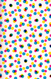
highly magnified screen dots of a light-gray surface
As in chromatic photography it is also in multicolor printing possible to generate the variety of colors by combining the transparent ink layers Y, M, and C with the key color White. In that case we speak of three-color printing. However, three-color printing is a very unstable process which reacts to unavoidable ink variations in the printing press with changes in the appearance of colors in the chomatic picture. As texts are generally printed in black four-color printing offers black as fourth printing ink. In order to give the chromatic picture more stability the black is used to stabilize the gray scale and moreover to support the dark regions and to enhance the deep dimension of the picture. This color separation for the black printing ink is called Skeleton Black.
Achromatic Mixture and Chromatic Mixture
In the Conventional Four-color Printing process there are available 5 and not only 4 of the 8 Basic Colors as explained before. These are the 4 colors Yellow (Y), Magenta-red (M), Cyan-blue (C), and Black (K) and furthermore the Basic Color White (W) in form of the white paper surface. As a result of his new Theory of Color, Harald Kueppers pointed out that under these circumstances it is not sensible to generate achromatic values in a four-color process based on a three-color chromatic structure where chromatic printing inks are wasted as they neutralize one another in order to produce achromatic values.
As an alternative, Kueppers proposes the Achromatic Structure for four-color printing where achromatic values are always generated from the achromatic Basic Colors W and K. Chromatic printing inks will now only be used to produce chromatic values of the color shades. When doing this, each time only three of the four printing inks can accumulate, namely the achromatic color K with screen elements of two of the three chromatic printing inks. He proved the feasibility of this technique with his "Systematic Table for Achromatic Structure" (example), published for the first time in 1978 in the color atlas "Du Mont´s Farbenatlas" (English language edition "Color Atlas" 1982). This technique represents a substantial improvement in technology, economy, and ecology.
Between the two extreme possibilities of composing a picture, namely the consistent chromatic structure and the consistent achromatic structure, all intermediate stages are possible. This is one of the reasons for the problems of compatibility with electronic reproduction.
Optimal Color Reproduction and Seven-color Printing with Achromatic Structure
Additive Mixture as well as Subtractive Mixture would produce an optimal color reproduction in case each one of the three chromatic Basic Colors would be available in a condition as theoretically required. Unfortunately, neither the types of phosphorus in the screen plate of the monitor nor the printing inks do meet this requirement. They present unavoidable spectral defects which go almost undetected in case of primary colors but appear very noticeably with the secondary colors.
On the monitor the secondary colors Yellow (Y), Magenta-red (M), and Cyan-blue (C) are the ones which can only be reproduced in qualified, i.e. whitened condition. In three-color and four-color prints the secondary colors Orange-red (R), Green (G), and Violet-blue (B) appear in blackened condition. This is unsatisfactory for the reproduction of bright pure colors in these secondary areas.
For that reason Harald Kueppers developed a process for multicolor printing where all six chromatic Basic Colors plus Black are available as printing inks: the Seven-color Printing Process. For that he devised systematic color tables which he published in 1987 in his work " Der große Küppers-Farbenatlas " (The Great Kueppers Color Atlas) for which he obtained patents worldwide.
Also the printing process he invented has been patented worldwide where instead of superposed ink layers juxtaposed surface elements are used. In this process one works with either 7 transparent printing inks on white paper or 8 opaque inks on a paper which could be of any color. This printing process, invented by H. Kueppers, is the optimal solution for multicolor printing from both the technological and ecological point of view. Optimal color reproduction and a stable printing process are achieved with minimal consumption of resources, i.e. paper, printing ink and drying energy. (see book " Die Farbenlehre der Fernseh- Foto- und Drucktechnik " - Theory of Color for TV Engineering, Photography, and Printing Technology)
back to top